GUI Framework API
It is called within the oasis::ui namespace category.
OasisUI.h
Setup and Cleanup
Initializes oasis::ui and creates the default screen object.
parameters
The key-value map required for oasis::ui initialization.
The key-value map required for oasis::ui initialization is as follows:
system-font-path
The font file path used by Oasis. It supports TrueType fonts. If this key value is already specified in oasis::initialize, it will be overwritten.
system-font-size
10
The default font size used by Oasis, measured in points. If this key value is already specified in oasis::initialize, it will be overwritten.
display-rotation
0
Rotates the display device by the given angle. When operating to rotate by 90 degrees or 270 degrees, the GUI screen width uses the height value of the display device, and the screen height uses the width value of the display device. The height and width values of the display are configured by the oasis::display::setup API.
enable-touch
1
Activates the touch device.
touch-cal-data-path
The touch calibration data file path. If this data file is invalid, the touch function is deactivated. The content of the data file is a string listing 9 numbers separated by whitespace on a single line. For example, in the case of a 480x320 display device, it is "302 3967 244 3829 8583 5850 65536 480 320".
fb0-hlayer
The display HLAYER string used in the graphic context of the GUI. The string consists of each layer component ID separated by ":". For example, it is formatted like "1:1:0".
vi0-hlayer
The display HLAYER string used in YUV channels such as camera video. The string consists of each layer component ID separated by ":". For example, it is formatted like "1:0:0".
hide-unmanaged-ui-layer
The hLAYER string dedicated to external UI components (such as Qt) that are not managed by Oasis GUI. The string consists of each layer component ID separated by ":". For example, it is formatted like "1:2:0".
hide-unmanaged-ui-layers
The hLAYER list dedicated to external UI components (such as Qt) that are not managed by Oasis GUI. Each HLAYER is separated by a comma (,). For example, it is formatted like "1:2:0,1:3:0".
lcd-dpi-x
96.0
The dPI x value of the display.
lcd-dpi-y
96.0
The dPI y value of the display.
lcd-dpi
96.0
The dPI x and y values of the display.
Note
If both hide-unmanaged-ui-layer and hide-unmanaged-ui-layers keys are specified, hide-unmanaged-ui-layers is used.
The display module of the chipset supports multiple channels per purpose, and multiple layers per channel. It supports at least one channel and one layer.
Oasis manages the GUI side by dividing it into HLAYER to match the layer structure supported by the display module of each chipset.
HLAYER is a 32-bit integer value and has a 3-tuple structure with (channel, hard layer, soft layer) as its elements. When having a (channel, layer) structure depending on the chipset, the hLAYER string format is specified as a 2-tuple like "0:1". For example, if there are multiple cores responsible for display control, channel specifies the core index as 0, 1, 2, etc., hard layer specifies the layer supported by each core, and soft layer can have a structure generated by Oasis as needed.
Touch calibration data values are calculated using 5 points obtained by touching, as shown in the function below.
struct {
  int32_t x;
  int32_t y;
} touch[5] = { 0, };

int32_t cal[9] = { 0, };

void calibrate()
{
    double dx_min, dy_min, dx_max, dy_max;
    double dx_ratio, dy_ratio, scale = 65536.0;
    int32_t i;

    double x_distance = 0.0, y_distance = 0.0;

    x_distance += (double)(touch[4].x-touch[0].x);
    x_distance += (double)(touch[4].x-touch[3].x);
    x_distance += (double)(touch[1].x-touch[4].x);
    x_distance += (double)(touch[2].x-touch[4].x);
    x_distance /= 4.0;
    dx_ratio = (double)(screen[4].x-screen[0].x)/x_distance;

    y_distance += (double)(touch[4].y-touch[0].y);
    y_distance += (double)(touch[4].y-touch[1].y);
    y_distance += (double)(touch[3].y-touch[4].y);
    y_distance += (double)(touch[2].y-touch[4].y);
    y_distance /= 4.0;
    dy_ratio = (double)(screen[4].y-screen[0].y)/y_distance;

    dx_min = dx_max = 0.0;
    dy_min = dy_max = 0.0;

    for(i=0; i<5; i++) {
        dx_min += (double)touch[i].x - (double)screen[i].x/dx_ratio;
        dx_max += (double)touch[i].x + (double)(width_-screen[i].x)/dx_ratio;
        dy_min += (double)touch[i].y - (double)screen[i].y/dy_ratio;
        dy_max += (double)touch[i].y + (double)(height_-screen[i].y)/dy_ratio;
    }
    dx_min /= 5.0;
    dy_min /= 5.0;
    dx_max /= 5.0;
    dy_max /= 5.0;

    cal[0] = (int32_t)dx_min;
    cal[1] = (int32_t)dx_max;
    cal[2] = (int32_t)dy_min;
    cal[3] = (int32_t)dy_max;
    cal[4] = (int32_t)(dx_ratio*scale);
    cal[5] = (int32_t)(dy_ratio*scale);
    cal[6] = (int32_t)scale;
    cal[7] = 480;  //display width
    cal[8] = 320;  //display height
}

size_t save(const char *path)
{
    FILE *f = fopen(path, "w");
    if(!f) {
        return 0;
    }

    char cal_buffer[256];
    ssize_t len = sprintf(cal_buffer,"%d %d %d %d %d %d %d %d %d",
            cal[0], cal[1], cal[2], cal[3], cal[4], cal[5], cal[6], cal[7], cal[8]);
    fwrite (cal_buffer, 1, len, f);
    fclose(f);

    return len;
}
Physical (x, y) coordinates obtained when a touch event occurs are converted into screen coordinates used by the GUI, as shown in the function below.
struct {
  int32_t x;
  int32_t y;
} ui_touch;

void touchToScreen(int32_t x, int32_t y)
{
    ui_touch.x = (x - cal[0])*cal[4]/cal[6];
    ui_touch.y = (y - cal[2])*cal[5]/cal[6];
}
Below is an initialization example.
oasis::key_value_map_t parameters;

parameters["system-font-size"] = "11";
parameters["system-font-path"] = "/mnt/sd/NanumGothicCoding.ttf";
parameters["display-rotation"] = "0";
parameters["enable-touch"] = "1";
parameters["touch-cal-data-path"] = "/mnt/sd/cal.dat";

parameters["vi0-hlayer"] = "1:0:0";
parameters["fb0-hlayer"] = "1:1:0";
parameters["hide-unmanaged-ui-layer"] = "1:2:0";

ui::setup(parameters);
Below is an initialization example when using the display rotated by 270 degrees.
////////////////////////////////////////////////////////////////////////////////////////////
// display setup
parameters.clear();

parameters["memory-type"] = "ion"; //cma
parameters["screen-width"] = "720";
parameters["screen-height"] = "1920";

display::setup(parameters);


//////////////////////////////////////////////////////////////////////////////////////////
// ui setup
parameters.clear();

parameters["system-font-size"] = "10";
parameters["system-font-path"] = "/mnt/sd/consola.ttf";

parameters["display-rotation"] = "270";
parameters["enable-touch"] = "0";

parameters["fb0-hlayer"] = "0:1:0";
parameters["vi0-hlayer"] = "0:0:0";

err = ui::setup(parameters);
if (err < 0) {
  DLOG(DLOG_ERROR, "Oasis ui::setup failed\n");
  return -1;
}
Releases resources allocated in oasis::ui and terminates.
If the chipset driver exposes the display device to the device node tree like /dev/disp, it returns the corresponding device driver handle.
Returns the device handle number on success. Returns -1 if it is not supported or fails.
If the chipset driver uses a handle object for the display device, it obtains that object. This object is the display handle pointer of the chipset.
Returns the display handle object on success. Returns nullptr if it is not supported or fails.
Converts an HLAYER string format into an integer type of hlayer_t.
str
The hLAYER string pointer. The string consists of each layer component ID separated by ":". For example, it is formatted like "1:2:0".
Returns the converted value as hlayer_t on success. Returns -1 if the format is incorrect.
Note
The stringToHlayer API exists in the oasis namespace, not oasis::ui.
Screen
Obtains the default screen object.
Returns the default screen object if ui::setup is successful. Returns nullptr if it fails.
Obtains the width of the screen object.
Obtains the height of the screen object.
Makes the screen visible.
Returns the time taken to draw the screen in microseconds.
The time taken for drawing, measured in microseconds.
Generates screen capture data. The data format is PNG.
png_data
OUT
Returns the capture data.
flags
The flag value. Specify "0".
Returns the capture data size on success. Returns -1 on failure.
Adds the top-level window object to the screen.
Removes the specified top-level window object from the screen. If there is no reference to the specified window, it is destroyed.
Verifies whether the screen touch function is activated.
Returns true if activated. Returns false if deactivated.
Verifies whether the screen touch calibration data is valid.
Returns true if valid. Returns false if invalid.
Obtains the touch calibration data file path.
Returns the touch calibration data file path.
Updates the touch calibration data.
cal_data_path
The absolute path of the touch calibration data file.
Returns true if the update is successful. Returns false if it fails.
Verifies whether an external UI component layer such as Qt is open.
hlayer
The hLAYER used by the external UI component.
Returns true if the external UI component layer is open. Returns false if it is closed.
Closes an external UI component layer such as Qt. When closed, it is not visible on the display.
hlayer
The hLAYER used by the external UI component.
Opens an external UI component layer such as Qt.
hlayer
The hLAYER used by the external UI component.
Converts a pixel value into a point value according to the DPI value of the display.
pixel_size
The pixel value to convert.
The converted point value. Returns 0 if the display, screen, or DPI value is incorrect.
Converts a point value into a pixel value according to the DPI value of the display.
point_size
The point value to convert.
The converted pixel value. Returns 0 if the display, screen, or DPI value is incorrect.
Activates flags for UI development.
flags
The flag value to activate or deactivate.
set
Activates if true, and clears the corresponding flag value if false.
The flags are as follows:
enum UIDevelFlags : uint64_t {
    kUIDevelFlag_Border = 0x0000000000000001ull,
    kUIDevelFlag_PrintCallStackOnLayout = 0x0000000000000002ull
};
kUIDevelFlag_Border draws the border of each widget. The kUIDevelFlag_PrintCallStackOnLayout value is not used.
Specifies a string ID for the widget. The specified ID is also reflected in the class name of the widget. The ID is an empty string upon widget creation.
widget
Widget objects such as Button, Image, Label, Container, Window, etc.
id
The widget ID string to set.
Returns the iD string of the widget.
widget
The widget object.
The ID string of the widget.
Obtains the class name of the widget.
widget
The widget object.
The class name of the widget.
The default class names of widgets are as follows:
| Widget Object |
Class Name |
| Button |
Button |
| Dialog |
Dialog |
| DrawingArea |
DrawingArea |
| FixedLayout |
Fixed |
| GridLayout |
Grid |
| BoxLayout |
Box |
| SingleLayout |
Single |
| Image |
Image |
| Label |
Label |
| ListBox |
ListBox |
| Window |
Window |
When setting an ID string for a widget using ui::setID, the class name is changed to <Class Name>::<ID String>.
Specifies the starting position (x, y) of the widget. Each coordinate value is relative to the screen.
widget
The widget object.
x
The x coordinate value of the widget.
y
The y coordinate value of the widget.
Specifies a fixed size for the widget. For a widget with a fixed size configured, the container widget uses the fixed size when calculating the layout of this widget.
widget
The widget object.
width
The fixed size width of the widget.
height
The fixed size height of the widget.
Specifies a fixed size height for the widget. For a widget with a fixed size configured, the container widget uses the fixed size height when calculating the layout of this widget.
widget
The widget object.
height
The fixed size height of the widget.
Specifies a fixed size width for the widget. For a widget with a fixed size configured, the container widget uses the fixed size width when calculating the layout of this widget.
widget
The widget object.
width
The fixed size width of the widget.
Specifies the mode preferred by the widget when requesting size calculation. The container widget calculates the size of the widget based on this mode value.
widget
The widget object.
size_mode
The size request mode.
The SizeRequestMode values are as follows:
| SizeRequestMode |
Value |
Description |
| kSizeRequestHeightForWidth |
0 |
The widget calculates its preferred height while its width is known. |
| kSizeRequestWidthForHeight |
1 |
The widget calculates its preferred width while its height is known. When calling preferredWidth, the container widget calls preferredHeight first to know the height of the widget, and then calls preferredWidthForHeight. |
| kSizeRequestConstantSize |
2 |
The widget can respond to any size calculation request from the container widget. In this case, the container widget requests preferredWidth and preferredHeight first. |
Returns the drawing area of the widget. The graphic Context can draw within this area.
widget
The widget object.
rect
OUT
Returns the drawing area.
Note
The drawing area excludes the margin and padding sizes from the widget.
Configures user-defined data for the widget.
widget
The widget object.
user_data
The user-defined data pointer.
Obtains user-defined data of the widget.
widget
The widget object.
Returns the user-defined data. Returns nullptr if user-defined data is not configured.
Configures a dataset value for the widget.
widget
The widget object.
attr
The key value of the dataset to be configured.
value
The value of the dataset.
Obtains the dataset value of the widget.
widget
The widget object.
attr
The dataset key.
Returns the corresponding value if the value matching the key value exists, and returns nullptr if it does not exist.
Verifies whether the widget possesses the dataset key value.
widget
The widget object.
attr
The dataset key.
-
true: The key value exists.
-
false: The key value does not exist.
Applies the widget to be visible or invisible.
widget
The widget object.
visible
Makes the widget visible if true, and hides the widget if false.
Returns the previous state.
Verifies whether the widget is visible.
widget
The widget object.
-
true: State is configured to be visible.
-
false: State is configured to be invisible.
Specifies the background color of the widget.
widget
The widget object.
clr
The background color value.
repaint
Specifies whether to repaint immediately after background color specification. Repaints if true.
Returns the previous background color.
Specifies the border color of the widget.
widget
The widget object.
clr
The border color.
repaint
Specifies whether to repaint immediately after border color specification. Repaints if true.
Returns the previous border color.
Specifies the border thickness of the widget.
widget
The widget object.
size
The border thickness, measured in pixels.
repaint
Specifies whether to repaint after border thickness changes. Repaints if true.
Configures the vertical alignment of the widget inside the container widget.
widget
The widget object.
valign
The vertical alignment value.
The horizontal/vertical alignment values are as follows:
| AlignType |
Value |
Description |
| kAlignFill |
0 |
Fills the widget completely. For vertical alignment, it expands the height. For horizontal alignment, it expands the width. |
| kAlignStart |
1 |
Aligns the widget to the starting position. For vertical alignment, it places it at the top. For horizontal alignment, it places it on the left. |
| kAlignEnd |
2 |
Aligns the widget to the ending position. For vertical alignment, it places it at the bottom. For horizontal alignment, it places it on the right. |
| kAlignFill |
3 |
Aligns the widget to the center position. |
| kAlignBaseline |
4 |
Limited to vertical alignment, aligns to the baseline of the container of the widget. |
Configures the horizontal alignment of the widget inside the container widget.
widget
The widget object.
halign
The horizontal alignment value.
Specifies the margin value of the widget.
widget
The widget object.
margin
The margin value applied uniformly to top, bottom, left, and right, measured in pixels.
Specifies the margin value of the widget.
widget
The widget object.
margin_se
The left and right margin value, measured in pixels.
margin_tb
The top and bottom margin value, measured in pixels.
Specifies the margin value of the widget.
widget
The widget object.
margin_start
The starting (left) margin value.
margin_top
The top margin value.
margin_end
The ending (right) margin value.
margin_bottom
The bottom margin value.
Specifies the starting (left) margin of the widget.
widget
The widget object.
margin_start
The left margin value.
Specifies the ending (right) margin of the widget.
widget
The widget object.
margin_end
The right margin value.
Specifies the top margin of the widget.
widget
The widget object.
margin_top
The top margin value.
Specifies the bottom margin of the widget.
widget
The widget object.
margin_bottom
The bottom margin value.
Specifies the padding value for the widget.
widget
The widget object.
padding
The padding value applied uniformly to top, bottom, left, and right, measured in pixels.
Specifies the padding value for the widget.
widget
The widget object.
margin_se
The left and right padding value, measured in pixels.
margin_tb
The top and bottom padding value, measured in pixels.
Specifies the padding value for the widget.
widget
The widget object.
margin_start
The starting (left) padding value.
margin_top
The top padding value.
margin_end
The ending (right) padding value.
margin_bottom
The bottom padding value.
Specifies the starting (left) padding of the widget.
widget
The widget object.
padding_start
The starting padding value.
Specifies the ending (right) padding of the widget.
widget
The widget object.
padding_end
The ending padding value.
Specifies the top padding of the widget.
widget
The widget object.
padding_top
The top padding value.
Specifies the bottom padding of the widget.
widget
The widget object.
padding_bottom
The bottom padding value.
Searches for a widget by ID.
widget
The parent Container widget object.
id
The ID string of the widget to find.
If a widget having id is found among child widgets, it returns that widget object. Returns nullptr if not found or if the parent widget is invalid.
Requests resizing of the widget. The container widget receives this request and proceeds with layout calculation.
widget
The widget object.
Requests repainting of the widget.
widget
The widget object.
Verifies the preferred size of the widget.
widget
The widget object.
size
OUT
Returns the preferred size of the widget.
Temporarily prevents widget geometry updating and repainting.
widget
The widget object.
Unlocks the temporarily prevented widget geometry updating and repainting.
widget
The widget object.
Requests animation drawing on the widget (rAF). Once the callback is invoked, rAF can be requested again. If it is not requested, the animation drawing process stops.
widget
The widget object.
bind
The animation drawing callback function.
raf_bind_t is defined as follows:
To perform animation drawing on a DrawArea widget, implement it in the following manner:
// Creates a drawingArea from a player object and requests rAF on it.
int32_t Player::startDrawPictures()
{
    std::function<void(ui::WidgetRef,GraphicContextRef)> canvas_draw_bind = std::bind(&Player::draw, this, std::placeholders::_1, std::placeholders::_2);
    ui::DrawingAreaRef canvas = ui::createDrawingArea(canvas_draw_bind);
    ui::setID(canvas, "picture_canvas");
    ui::boxPackStart(vbox, canvas, true, true, 0);
    ui::requestAnimatedFrame(canvas, canvas_draw_bind);
}

void Player::draw(ui::WidgetRef widget, GraphicContextRef gc)
{
    Rect rect;
    ui::getCanvasRect(widget, rect);

    // Perform drawing.

    if(!completed_) {
        // Request rAF again as needed.
        std::function<void(ui::WidgetRef,GraphicContextRef)> canvas_draw_bind = std::bind(&Player::draw, this, std::placeholders::_1, std::placeholders::_2);
        ui::requestAnimatedFrame(widget, canvas_draw_bind);
    }
}
Activates layout-related logging.
widget
The widget object.
enable
Activates logging if true, and clears logging if false.
apply_to_children
Specifies whether to apply this to child widgets. Applies to child widgets if true. Does not apply to child widgets if false.
Configures developer flags on the widget.
widget
The widget object.
flags
The flag.
set
The flag value is configured if true, and the flag value is cleared if false. Refer to the setDevelFlags API for flag values.
apply_to_children
Specifies whether to apply this to child widgets. Applies to child widgets if true. Does not apply to child widgets if false.
Container Interface
Oasis GUI layouts child widgets using the following layout containers:
Box container widget for arranging in vertical or horizontal directionsFixed container widget for arranging at fixed positionsGrid container widget for arranging by specifying rows and columns in a grid mannerSingle container widget that has only a single child widgetListBox container widget capable of scrolling in a list style
These are widgets derived from the container interface.
A container widget can include other container widgets.
The container interface is created via createBox, createFixed, createGrid, createWindow, createButton, createListBox, etc.
Adds a widget as a child to the layout container widget.
container
The container object.
widget
The widget object to add.
Removes a widget from the layout container widget.
container
The container object.
widget
The widget object.
Box Container
The box container widget arranges child widgets horizontally or vertically.
Creates a box container widget.
orientation
Specifies the layout direction. Enter either ui::kOrientationVertical or ui::kOrientationHorizontal. ui::kOrientationVertical arranges child widgets from top to bottom, and ui::kOrientationHorizontal arranges child widgets from left to right.
homogeneous
If set to true, child widgets have a homogeneous size. For ui::kOrientationVertical, heights are homogeneous; for ui::kOrientationHorizontal, widths are homogeneous.
spacing
Specifies the space between each child widget, measured in pixels.
Returns the box container widget on success. Returns nullptr on failure.
Draws the border of the box container widget.
box
The box container widget created via createBox.
x0
The x coordinate of the top-left corner.
y0
The y coordinate of the top-left corner.
x1
The x coordinate of the bottom-right corner.
y1
The y coordinate of the bottom-right corner.
clr
The border color.
Adds a child widget to the box container widget based on the starting position of the box. If there are widgets already added via
boxPackStart, it is appended immediately after them.
box
The box container widget created via createBox.
widget
The child widget object to add.
expand
Specifies whether to expand the widget. When arranging in the ui::kOrientationVertical direction, it expands the height. When arranging in the ui::kOrientationHorizontal direction, it expands the width. If the expand property of multiple child widgets is true, those child widgets expand proportionally to their sizes.
fill
Specifies whether to fill the widget in the expanded height or width. When arranging in the ui::kOrientationVertical direction, it fills the height. When arranging in the ui::kOrientationHorizontal direction, it fills the width. If fill is false, it is arranged to match the align property value of the widget. Applied only when expand is true.
padding
The spacing with the widget added just before, measured in pixels. The total space size between widget and widget equals the sum of box spacing and this padding value. The padding of the widget itself is applied inside the widget.
Adds a child widget to the box container widget based on the ending position of the box. If there are widgets already added via
boxPackEnd, it is appended immediately before them.
box
The box container widget created via createBox.
widget
The child widget object to add.
expand
Specifies whether to expand the widget. When arranging in the ui::kOrientationVertical direction, it expands the height. When arranging in the ui::kOrientationHorizontal direction, it expands the width. If the expand property of multiple child widgets is true, those child widgets expand proportionally to their sizes.
fill
Specifies whether to fill the widget in the expanded height or width. When arranging in the ui::kOrientationVertical direction, it fills the height. When arranging in the ui::kOrientationHorizontal direction, it fills the width. If fill is false, it is arranged to match the align property value of the widget. Applied only when expand is true.
padding
The spacing with the widget added just before, measured in pixels. The total space size between widget and widget equals the sum of box spacing and this padding value. The padding of the widget itself is applied inside the widget.
Fixed Container
The fixed container widget places child widgets at fixed positions.
Creates a fixed container widget.
Returns the fixed container widget.
Adds a child widget to the fixed container widget at the given (x, y).
fixed
The fixed container widget created via createFixed.
widget
The child widget object to add.
x
The x coordinate of the child widget.
y
The y coordinate of the child widget.
fixed
The fixed container widget created via createFixed.
widget
The child widget object to remove.
Grid Container
The grid container widget arranges child widgets based on rows and columns.
Creates a grid container widget.
Returns the grid container widget.
Arranges rows so that their heights are equal.
grid
The grid container widget created via createGrid.
homogeneous
Arranges child widgets by setting grid rows to the same size.
Arranges columns so that their widths are equal.
grid
The grid container widget created via createGrid.
homogeneous
Arranges child widgets by setting grid columns to the same size.
Configures spacing between rows.
grid
The grid container widget created via createGrid.
spacing
Specifies the spacing between rows, measured in pixels.
Configures spacing between columns.
grid
The grid container widget created via createGrid.
spacing
Specifies the spacing between columns, measured in pixels.
Configures column width to a fixed width.
grid
The grid container widget created via createGrid.
col
The column index, starting from 0.
width
The fixed width, measured in pixels.
Configures row height to a fixed height.
grid
The grid container widget created via createGrid.
row
The row index, starting from 0.
height
The fixed height, measured in pixels.
Adds a child widget to the grid container widget.
grid
The grid container widget created via createGrid.
widget
The child widget object to add.
left
The starting column index of the grid where the child widget will be located.
top
The starting row index of the grid where the child widget will be located.
width
The number of grid columns occupied by the child widget.
height
The number of grid rows occupied by the child widget.
Single Container
Created via createWindow, createDialog, createButton, etc.
ListBox Container
The listBox container widget arranges child widgets as a scrollable container.
Creates a listBox container widget.
type
Specifies the listBox type. Specify either ui::kListBoxFixedItemSize or ui::kListBoxDynamicItemSize.
Returns the listBox container widget.
Adds a child widget to the listBox container widget at the specified position.
listbox
The listBox container widget object created via createListBox.
widget
The child widget object to add.
position
Specifies the position of the child to add. If the position value is -1 or greater than the current number of child widgets in the listBox, it is appended to the end. If the position value is 0, it is prepended to the front.
Removes a child widget from the listBox container widget.
listbox
The listBox container widget object created via createListBox.
widget
The child widget object to remove.
Removes all child widgets from the listBox container widget.
listbox
The listBox container widget object created via createListBox.
Adds a child widget visible when the listBox container widget is empty. This widget is not a child widget actually included in the listBox. It is not visible if there is one or more child widgets.
listbox
The listBox container widget object created via createListBox.
placeholder
The widget object to be displayed in an empty ListBox.
Scrolls up.
listbox
The listBox container widget object created via createListBox.
Scrolls down.
listbox
The listBox container widget object created via createListBox.
Pages up.
listbox
The listBox container widget object created via createListBox.
Pages down.
listbox
The listBox container widget object created via createListBox.
Window
Creates a top-level window object. The parent class of the window object is SingleLayout. The window object is created in an invisible state. Call showWindow or similar to make it visible on screen.
title
The title of the window. Specifying nullptr does not create the window title bar.
Returns the window object on success, and returns nullptr on failure.
Releases the window object.
Specifies whether to display the title bar on the window.
show
The title bar is visible if true, and the title bar is invisible if false.
Finds the window object corresponding to the iD.
id
The ID of the window object. Differs from the title value.
Returns the window object if found, and returns nullptr if not found.
Specifies as the topmost window. The topmost window exists above all windows and is not obscured by other windows.
Waits until the specified window object is released. Other UI events are processed by creating an independent RunLoop.
Dialog
Creates a dialog widget.
parent_window
The parent window widget of the dialog object.
title
Specifies the title of the dialog window. If nullptr, the title bar is not created.
Returns the dialog widget object on success. Returns nullptr on failure.
Returns the box container widget responsible for the overall layout of the dialog widget.
The box container widget object.
Returns the box container widget responsible for the arrangement of the content area of the dialog widget.
The box container widget object.
Adds a text button to the dialog widget.
button_text
The text of the button.
response_id
Specifies the iD value generated upon clicking or touching.
Returns the created button widget on success. Returns nullptr on failure.
Adds an image button to the dialog widget.
image_path
The path to the image file of PNG or JPEG type.
response_id
Specifies the iD value generated upon clicking or touching.
Returns the created button widget on success. Returns nullptr on failure.
Adds a button to the dialog widget. The ID value of the button is used as the response value upon clicking or touching.
widget
The button widget object.
Specifies the waiting time when letting the dialog widget close automatically.
timeout_msecs
The waiting time in milliseconds.
response_id
The response code value when closed automatically.
Configures the default response code value of the dialog widget.
response_id
The default response code value.
Displays the dialog widget on the screen. It waits until the dialog terminates.
The response code value of the dialog widget. Returns -1 on failure.
Returns the response code of the dialog widget and terminates.
response_id
The response code value.
Releases the dialog widget.
Creates an image button widget.
image_path
The path to the image file of PNG or JPEG type.
Returns the button widget object on success. Returns nullptr on failure.
Creates a text button widget.
label
The text.
single_line
Displayed on a single line if true. Displayed on multiple lines if false.
Returns the button widget object on success. Returns nullptr on failure.
Creates a button widget object having an image and text.
label
The text.
image_path
The path to the image file of PNG or JPEG type.
orientation
Specifies the image and text arrangement method. Specify either kOrientationVertical or kOrientationHorizontal. If kOrientationVertical, the image and text are arranged vertically; if kOrientationHorizontal, the image and text are arranged horizontally.
single_line
The text is displayed on a single line if true. The text is displayed on multiple lines if false.
Returns the button widget object on success. Returns nullptr on failure.
Obtains the label widget object of the button widget.
button
The button widget object.
Returns the label widget object.
Obtains the image widget object of the button widget.
button
The button widget object.
Changes the text of the button widget. Creates the label widget if it does not exist.
button
The button widget object.
text
The text.
Specifies the text color.
button
The button widget object.
clr
The text color.
Sets the image of the button. Creates the image widget if it does not exist.
button
The button widget object.
image_path
The path to the image file of PNG or JPEG type.
Image
Creates an Image widget from a pNG file.
image_path
The path to the image file of PNG or JPEG type.
Returns the image widget object on success. Returns nullptr on failure.
Creates an Image widget object applying a specific image format.
image_path
The path to the image file of PNG or JPEG type.
format
Specifies the specific image format to use. Specifying a value of -1 assigns the OASIS_PIXEL_FORMAT_BGRA_8888 format. Refer to the oasisTypes.h header file for pixel formats.
Returns the image widget object on success. Returns nullptr on failure.
The pixel formats supported for PNG image files are as follows:
- OASIS_PIXEL_FORMAT_BGRA_8888
- OASIS_PIXEL_FORMAT_BGRX_8888
- OASIS_PIXEL_FORMAT_ABGR_8888
- OASIS_PIXEL_FORMAT_XBGR_8888
- OASIS_PIXEL_FORMAT_ARGB_8888
- OASIS_PIXEL_FORMAT_XRGB_8888
The pixel formats supported for JPEG image files are as follows:
- OASIS_PIXEL_FORMAT_BGRA_8888
- OASIS_PIXEL_FORMAT_RGBA_8888
- OASIS_PIXEL_FORMAT_ARGB_8888
- OASIS_PIXEL_FORMAT_ABGR_8888
- OASIS_PIXEL_FORMAT_XRGB_8888
- OASIS_PIXEL_FORMAT_XBGR_8888
- OASIS_PIXEL_FORMAT_RGBX_8888
- OASIS_PIXEL_FORMAT_BGRX_8888
- OASIS_PIXEL_FORMAT_RGB_888
- OASIS_PIXEL_FORMAT_BGR_888
Creates an Image widget object applying paddings.
image_path
The path to the image file of PNG or JPEG type.
paddings
Specifies top, bottom, left, and right padding, measured in pixels.
Returns the image widget object on success. Returns nullptr on failure.
Creates an Image widget object applying a specific image format and paddings.
image_path
The path to the image file of PNG or JPEG type.
format
Specifies the specific image format to use. Specifying a value of -1 assigns the OASIS_PIXEL_FORMAT_BGRA_8888 format. Refer to the oasisTypes.h header file for pixel formats.
paddings
Specifies top, bottom, left, and right padding, measured in pixels.
Returns the image widget object on success. Returns nullptr on failure.
Creates a new Image widget object by selecting a specific region of another Image widget.
ref_image
The reference target Image widget object.
crop_x
The top-left x coordinate of the cROP region.
crop_y
The top-left y coordinate of the cROP region.
crop_width
The width of the cROP region.
crop_height
The height of the cROP region.
Returns the image widget object on success. Returns nullptr on failure.
Updates with a new image.
image
The image widget object.
image_path
The path to the image file of PNG or JPEG type.
Copies the image of a new CROP region from a reference Image widget.
image
The image widget object.
ref_image
The reference Image widget object.
crop_x
The top-left x coordinate of the cROP region.
crop_y
The top-left y coordinate of the cROP region.
crop_width
The width of the cROP region.
crop_height
The height of the cROP region.
Configures the color key.
image
The image widget object.
color_key
The color key value. All parts matching this color are processed as transparent.
Deactivates the alpha channel.
image
The image widget object.
Obtains the image width.
image
The image widget object.
Returns the image width, measured in pixels.
Obtains the image height.
image
The image widget object.
Returns the image height, measured in pixels.
Obtains the image size.
image
The image widget object.
size
OUT
Returns the image size.
Rotates the image by the specified angle.
image
The image widget object.
src_rect
The target region to rotate.
dst_rect
The destination region to which rotation is applied.
angle
The angle to rotate.
center
The center coordinates of the rotation axis.
Label
Creates a label widget.
Returns the label widget object on success. Returns nullptr on failure.
Changes the label text.
label
The label widget object.
text
The label text to change.
Specifies the label horizontal alignment method.
label
The label widget object.
Justification
Enter one of the Justification values.
The horizontal Justification values are as follows:
| Justification |
Value |
Description |
| kJustificationLeft |
0 |
Aligns to the left. |
| kJustificationRight |
1 |
Aligns to the right. |
| kJustificationCenter |
2 |
Aligns to the center. |
| kJustificationFill |
3 |
Aligns equally. |
Specifies the label vertical alignment method.
label
The label widget object.
Justification
Enter one of the Justification values.
The vertical Justification values are as follows:
| Justification |
Value |
Description |
| kJustificationTop |
0 |
Aligns to the top. |
| kJustificationBottom |
1 |
Aligns to the bottom. |
| kJustificationVCenter |
2 |
Aligns to the vertical center. |
| kJustificationFill |
3 |
Aligns equally. |
Specifies whether to automatically wrap lines by character unit.
label
The label widget object.
enable
Wraps lines automatically by character unit if true.
Specifies whether to support multiple lines.
label
The label widget object.
disable
Renders as a single line instead of multiple lines if true.
Specifies the label text color.
label
The label widget object.
clr
The label text color.
Changes the label text font and point size.
label
The label widget object.
point_size
The label font size, measured in points.
font_path
The label font file path.
Sets the label font size.
label
The label widget object.
point_size
The point size of the label text.
Specifies whether to apply alpha mode when rendering the label.
label
The label widget object.
enable
Alpha mode is applied to render with anti-aliasing if true.
Graphic Context
Oasis performs operations to draw on the screen using the graphicContext object.
If hardware acceleration is supported, it uses hardware acceleration.
Drawing can be performed via the drawingArea widget.
Obtains the graphicContext object from a widget object.
widget
The widget object.
Returns the graphicContext object on success. Returns nullptr on failure.
Starts drawing.
graphic_context
The graphicContext object.
Ends drawing. Reflects the contents drawn during that time to the display.
graphic_context
The graphicContext object.
Saves the current GraphicContext properties to the stack.
graphic_context
The graphicContext object.
Restores the immediately previously saved GraphicContext from the stack.
graphic_context
The graphicContext object.
Draws a line.
graphic_context
The graphicContext object.
x0
The starting x coordinate of the line.
y0
The starting y coordinate of the line.
x1
The ending x coordinate of the line.
y1
The ending y coordinate of the line.
clr
The line color.
Draws a vertical line.
graphic_context
The graphicContext object.
x
The x coordinate of the vertical line.
top
The starting y coordinate of the vertical line.
bottom
The ending y coordinate of the vertical line.
clr
The line color.
Draws a horizontal line.
graphic_context
The graphicContext object.
y
The y coordinate of the horizontal line.
left
The starting x coordinate of the horizontal line.
right
The ending x coordinate of the horizontal line.
clr
The line color.
Draws a rectangle.
graphic_context
The graphicContext object.
left
The top-left x coordinate of the rectangle.
top
The top-left y coordinate of the rectangle.
right
The bottom-right x coordinate of the rectangle.
bottom
The bottom-right y coordinate of the rectangle.
clr
The border color.
Fills a rectangle.
graphic_context
The graphicContext object.
left
The top-left x coordinate of the rectangle.
top
The top-left y coordinate of the rectangle.
right
The bottom-right x coordinate of the rectangle.
bottom
The bottom-right y coordinate of the rectangle.
clr
The color to fill.
Changes font and font size.
graphic_context
The graphicContext object.
point_size
The font size, measured in points.
font_path
The path to the font file.
Specifies the character foreground color.
graphic_context
The graphicContext object.
argb
The character color.
Specifies the character background color.
graphic_context
The graphicContext object.
argb
The character background color.
Specifies the character background color processing method.
graphic_context
The graphicContext object.
bk_mode
Specifying kTextBkModeTransparent processes the character background as transparent. Specifying kTextBkModeOpaque applies the character background color.
Draws text.
graphic_context
The graphicContext object.
string
The 32-bit UNICODE string vector.
left
The top-left x coordinate of the region where the string will be drawn.
top
The top-left y coordinate of the region where the string will be drawn.
width
The width of the region where the string will be drawn.
height
The height of the region where the string will be drawn.
flags
The flag value to be referenced when drawing strings.
caret_index
The cursor shape to use. Not used
caret_pos
The cursor position. Not used
The flags value of drawText performs OR'ing of the following values:
| flag |
Value |
Meaning |
| DT_TOP |
0x00000000 |
Aligns the vertical reference of the text to the top. |
| DT_LEFT |
0x00000000 |
Aligns the text to the left. |
| DT_CENTER |
0x00000001 |
Aligns the text to the center. |
| DT_RIGHT |
0x00000002 |
Aligns the text to the right. |
| DT_VCENTER |
0x00000004 |
Aligns the vertical reference of the text to the center. |
| DT_BOTTOM |
0x00000008 |
Aligns the vertical reference of the text to the bottom. |
| DT_WORDBREAK |
0x00000010 |
Allows line breaking by word unit. |
| DT_SINGLELINE |
0x00000020 |
Processes as a single line. |
| DT_CALCRECT |
0x00000400 |
Calculates the region where the string will be drawn. It does not actually draw. |
| DT_NOPREFIX |
0x00000800 |
Does not process the prefix symbol (&) in the string. If it is \"&abc\", it is drawn as \"abc\". |
| DT_NOFULLWIDTHCHARBREAK |
0x00080010 |
If a single character exceeds the allowed width, it processes that character without line breaking. |
graphic_context
The graphicContext object.
string
The string.
left
The top-left x coordinate of the region where the string will be drawn.
top
The top-left y coordinate of the region where the string will be drawn.
width
The width of the region where the string will be drawn.
height
The height of the region where the string will be drawn.
flags
The flag value to be referenced when drawing strings.
caret_index
The cursor shape to use. Not used
caret_pos
The cursor position. Not used
Specifies the background color of the widget. It is applied only when drawing, and overwrites the background color of the original widget.
graphic_context
The graphicContext object.
clr
The background color.
Drawing Area
Creates a drawingArea widget.
handler
The drawing callback function.
Returns the drawingArea widget on success. Returns nullptr on failure.
Below is an example of creating and drawing a drawingArea:
int32_t App::create()
{
    // Creates a drawingArea object.
    canvas_ = ui::createDrawingArea(std::bind(&App::draw, this, std::placeholders::_1, std::placeholders::_2));
    ui::setID(canvas_, "my_drawingarea");
    ui::gridAttach(grid, canvas_, 0, 0, 1, 1);
}

void App::draw(ui::WidgetRef widget, GraphicContextRef gc)
{
    // Paints the entirety in black.
    Color clr_bk(255, 0, 0, 0);
    ui::fillRectangle(gc, 0, 0, width_, height_, clr_bk);

    // Draws a yellow box.
    Color clr_line(255, 255, 255, 0);
    ui::drawRectangle(gc, 10, 10, 100, 100, clr_line);

    // Draws a string.
    std::string text = "안녕하세요!";
    ui::setFont(gc, 11);
    ui::setTextForeColor(gc, Color(255, COLOR_WHITE)());
    ui::drawText(gc, str, 20, 20, 80, 80, DT_CENTER|DT_VCENTER);
}
Keypad
Creates a keypad.
parent_window
The parent window object.
keypad_title
The keypad title.
init_value
The initial value of the keypad string.
cancel_label
The label of the cancel button.
ok_label
The label of the oK button.
Returns a keypad object on success. Returns nullptr on failure.
Releases the keypad object.
keypad
The keypad object.
Displays the keypad and waits until the user presses the oK or cancel button.
keypad
The keypad object.
Returns the modified string. If cancel is pressed, the original string is returned without modification.
Below is an example utilizing the keyboard:
void cancel_handler(int sig)
{
ui::quitAllRunContexts();
got_interrupt = true;
}
int main(int argc, char *argv[])
{
int32_t err;
signal(SIGINT, cancel_handler);
oasis::key_value_map_t parameters;
parameters["offs-disable"] = "1";
if(oasis::initialize(parameters) < 0) {
DLOG(DLOG_ERROR, "Oasis init failed\n");
return -1;
}
////////////////////////////////////////////////////////////////////////////////////////////
// display setup
parameters.clear();
parameters["memory-type"] = "ion"; //cma
parameters["screen-width"] = "480";
parameters["screen-height"] = "320";
display::setup(parameters);
//////////////////////////////////////////////////////////////////////////////////////////
// ui setup
parameters.clear();
parameters["system-font-size"] = "11";
parameters["system-font-path"] = "/mnt/sd/NanumGothicCoding.ttf";
parameters["display-rotation"] = "0";
parameters["enable-touch"] = "1";
parameters["touch-cal-data-path"] = "/mnt/sd/cal.dat";
err = ui::setup(parameters);
if (err < 0) {
DLOG(DLOG_ERROR, "Oasis ui::setup failed\n");
return -1;
}
//////////////////////////////////////////////////////////////////////////////////////////
//////////////////////////////////////////////////////////////////////////////////////////
ui::ScreenRef screen = ui::getDefaultScreen();
int32_t screen_width = ui::screenWidth(screen);
int32_t screen_height = ui::screenHeight(screen);
ui::DialogRef dialog = ui::createDialog(nullptr);
ui::setBgColor(dialog, Color(255, COLOR_BLACK));
ui::setBorderSize(dialog, 0, false);
ui::BoxRef dialog_container = ui::getDialogContainerBox(dialog);
ui::setHAlign(dialog_container, ui::kAlignFill);
ui::setVAlign(dialog_container, ui::kAlignFill);
ui::setMargin(dialog_container, 0);
ui::BoxRef content_area = ui::getDialogContentArea(dialog); //horz box layout
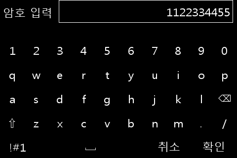
ui::KeypadRef keypad = ui::createKeypad(dialog, "암호 입력", "1122334455", "취소", "확인");
ui::screenAdd(screen, dialog);
std::string str = ui::showKeypad(keypad);
err = ui::runDialog(dialog);
ui::destroyDialog(dialog);
err = ui::cleanup();
oasis::finalize();
return 0;
}
This is the keypad screen displayed in the application example:
Timer
Creates a timer.
timeout_name
The name of the timer.
intervalUs
Specifies the occurrence cycle of the timer event, measured in microseconds.
slot
Registers the timer event handler.
Returns the timer ID on success. Returns -1 on failure.
source_slot_t is defined as follows:
The user-defined timer callback function.
-
true: Maintains timer operation.
-
false: Stops and removes the timer automatically.
Activates the timer.
timeout_id
The timer ID value.
enable
Activates the timer if true, and stops the timer if false.
Verifies whether the timer is currently operating.
-
true: The timer is operating.
-
false: The timer is stopped.
Below is an example triggering a timer at 1-second intervals:
// Creates a timer.
timer_id_ = ui::timeoutAdd("tick_timer", 1000000, sig::mem_fn(*this, &App::tickTimer));
if(timer_id_ > 0) {
  // Starts the timer.
  ui::timeoutEnable(timer_id_, true);
}

bool App::tickTimer()
{
  // Perform timer task.

  // Return false to release the timer.
  //return false;
  return true;
}
Signaling
Oasis GUI event generation and processing utilizes the signal-slot mechanism.
Connects an event handler function to a target object.
object
The object that triggers the event, acting as the target object for signal connection.
signal_name
The event signal name.
slot
The event handler function.
flags
The flag value. Configure 0.
Disconnects an event handler function connection. When the target widget is released, the signal processing connection is automatically disconnected.
signal_id
The signal ID value to disconnect.
Oasis utilizes a signaling template for handling the following click and touch events:
- clicked
- touch-up-event
- touch-down-event
- touch-move-event
The types for individual event handler functions are as follows:
The user-defined click event callback function.
ui::WidgetRef
The widget object where the click event occurred.
The user-defined touch down event callback function.
ui::ScreenRef
The screen object where the touch event occurred.
ui::TouchEvent*
The touch event data.
The user-defined touch up event callback function.
ui::ScreenRef
The screen object where the touch event occurred.
ui::TouchEvent*
The touch event data.
The user-defined touch move event callback function.
ui::ScreenRef
The screen object where the touch event occurred.
ui::TouchEvent*
The touch event data.
int32_t x
The x coordinate of the device.
int32_t y
The y coordinate of the device.
int32_t z
The z coordinate of the device. Indicates the pressure value.
int32_t screen_x
The x coordinate on the screen.
int32_t screen_y
The y coordinate on the screen.
bool is_down
Possesses a value of true if pressed.
int32_t repeat
Indicates the repeat count. Used to distinguish double touch, triple touch, etc.
uint64_t timestamp
The timestamp at the time of occurrence, measured in microseconds.
int32_t holding_msec
The duration of maintaining the pressed state, measured in milliseconds.
Below are Signal connection examples:
// Connects the "clicked" signal handler
uint32_t clicked_sigid = ui::connectSignal(apply_button, "clicked", clicked_slot_t(sig::mem_fn(*this, &App::applyButtonClicked)), 0);

// Connects the "touch-down-event" signal handler
uint32_t touch_down_event_sigid = ui::connectSignal(drawing_canvas, "touch-down-event", touch_down_event_slot_t(sig::mem_fn(*this, &App::touchedDown)), 0);

// Connects the "touch-up-event" signal handler
uint32_t touch_up_event_sigid = ui::connectSignal(drawing_canvas, "touch-up-event", touch_up_event_slot_t(sig::mem_fn(*this, &App::touchedUp)), 0);

// Connects the "touch-move-event" signal handler
uint32_t touch_move_event_sigid = ui::connectSignal(drawing_canvas, "touch-move-event", touch_move_event_slot_t(sig::mem_fn(*this, &App::touchedMove)), 0);
Running Context
Oasis utilizes RunningLoop for event processing. RunningLoop contains RunContext.
Used when attempting to forcibly terminate the application from a signal handler such as SIGINT.
Terminates all RunContexts.